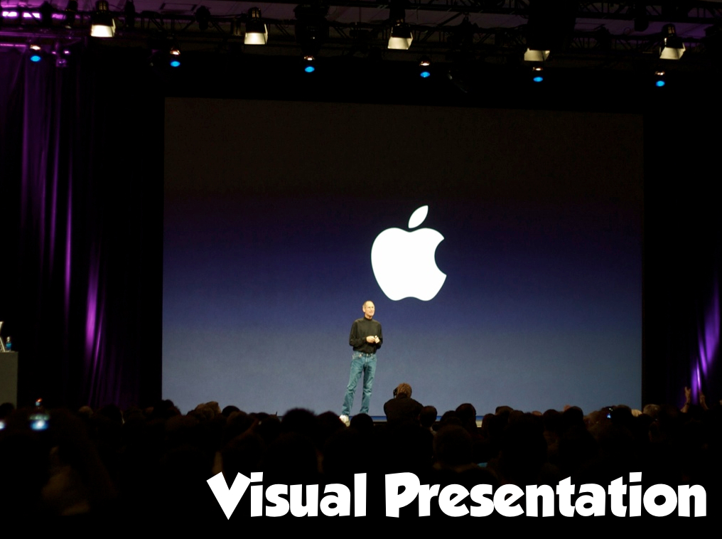
6 Important Visual Presentation Tips
Presenters want their audience to understand what they try to say and want them to be fully engaged when they are giving a presentation, and that is why the visual way or visual presentations are used. When bullet points, pie charts, and graphs do not seem to work, pictures are used to communicate, as it has always been noted that people tend to remember things better when they are discussed visually. But just creating a haphazard visual presentation will also do no good to you, you need to create an effective one, and to help you create the best one given below are some important yet easy to follow visual presentation tips.

6 Important Visual Presentation Tips That You Need to Know
1. Use just one strong image each slide
If you put a number of images in each slide, that is not going to help you at all. Just like if you have too much text on one slide it is difficult to read, similarly, too many images are difficult to follow and look only cluttered and unprofessional. Just find out one strong image that speaks about the item you want to discuss and add some phrase or a word to put more emphasis on what you desire to convey. Instead of copying pictures from the net you need to use a source that offers high-resolution images.
2. The right size and right font is needed
Even typography is visual. Though most people use Times New Roman or Helvetica for presentations, neither of them are standard fonts that must be used. So, it will be rather wise if you check the other available fonts and use the one that looks creative and also will give your presentation such a look as if it was created by a professional. You can search for websites that offer free fonts and then can combine and experiment until you find something that looks really good. At the same time, do not end up looking frivolous, and try to limit your font style selection to a maximum of 3 each slide. Though there is no fixed font size that needs to be used for visual presentations, the size 40 looks good in most cases. You, of course, need to keep in mind the size of the room where you will be giving the presentation, as the person sitting at the extreme back side should be able to read your slides without difficulty.
3. Add numbers on your pictures
If you add images in the graphs not only do they look more attractive to the audience, they are also better understood and easily remembered. At the same time, you can also add percentages and numbers on the images, as that will also help create a similar effect.
4. Choose the right software and the right theme
To share your presentation with your audience you need the right video presentation tools. Remember, only the right software will help give you a flawless presentation and will also help you control your presentation just the way you want to. One of the best and most popularly used tools for the purpose is ezTalks. Now that you have decided on the software, you must give importance to the theme of your presentation and all your slides must match this theme. Earlier, presentations would have a single background for each of the slides, but now things are different, you can have a theme that each of your slides will follow. You can choose any background color you want to, as long as it looks professional.
5. Use dynamic visuals
It is true that images help make your data easily accepted, and dynamic visuals make them even more interesting, thus aiding your audience in paying more attention, understanding things clearly, and retaining information. To enhance your visual content further, consider incorporating an easy-to-use online video editor. This tool can elevate your presentations by seamlessly integrating dynamic video elements, providing a versatile means of conveying information. Including engaging visuals not only captures your audience's interest but also facilitates a more comprehensive understanding of the content. So, do try to utilize dynamic visuals
6. Offer handouts
Visuals do not mean only images that can be seen on your presentation slides. So, one of the most important tips for a good visual presentation is to offer handouts to each member of your audience which summarizes the points that were discussed. These handouts need to be presented once the presentation comes to an end. Do remember that your handouts should also look visually attractive. So, together with spending time in creating a nice visual presentation, you also need to spend enough time into creating nice attractive handouts.
Conclusion
Visual presentations have proven to be immensely beneficial for all companies – large and small. It helps hold the audience's attention in a much better way and they also enjoy and thus remember things properly. Just make sure you choose the right and high-quality images that help pass your message across successfully, and you present them in the right way. Also, do not forget to use the best presentation software like ezTalks, as only then will you be able to offer your visual presentation the exact way you want.