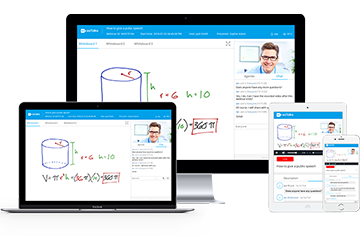
Best Webinar Landing Page Examples
Webinars open up plenty of opportunities to expand your marketing strategy and connect with your ideal audience. Still, when preparing for a webinar, an event landing page is the one thing that you can’t ignore. Let’s explore those webinar platforms having an extremely worthwhile webinar landing page.

Best Landing Page Example
- Free for up to 100 Participants
- Easy to Rebrand and Design
- Fluent HD Video/Audio Quality
- Screen Sharing and Whiteboard
- Polls, Survey and Recording
Best Webinar Landing Pages
1. ezTalks Webinar
Need your own style? No worries! ezTalks Webinar platform can be customized to match the style of your company or event.
Content
Relevant information pertaining to the audience can be gotten easily by virtue of its webinar landing page templates. Fields including First Name, Last Name, Email and Country are set automatically while other fields like Phone Number, Department, Company Name, Facebook can be selected according to your needs.
More other webinar templates like agenda script template help you complete the whole landing page effortlessly. ezTalks Webinar landing page will show a summary/webinar agenda explaining how the webinar will benefit attendees and when they can join the event to gather more target crowds.
Call to Action
The webinar landing page design of your event dictates the actions that the users should take.
√ Long forms seem like a daunting task while too short forms can’t contain the info you may need. Dedicated and promotion-specific landing pages using neat layout design and proper length are what ezTalks focuses on.
√ Besides, you can add your logo or background image to make the landing page shine, helping to attract the gaze of people. This visible design immediately makes you more likely to convert.
Usability
You can create a landing page where interested parties sign up for the webinar. The ezTalks Webinar landing page can cater to each kind of devices and can be accessed anywhere, anytime so that you can get the utmost publicity effect. More importantly, it is a free webinar platform for each registrant.
Want to try other interactive features? Sign up free now!

2. GoToWebinar
GoToWebinar landing page is also one of the best webinar landing page examples. It allows you to customize your webinar to your liking. For example, you can edit the title and description here just like ezTalks Webinar. Besides, you may also include your own logo on all webinar pages and emails by clicking Edit in the Branding and Theme section on the Manage Webinar page to promote your brand or event effectively. But it’s not acceptable for those who’re unwilling to spend much time on this part, as there’re relatively too many details like list presenters or co-organizer in the waiting room, welcome message, disclaimer etc. need to be completed.
3. Lithium Webinar
Lithium Webinar reflects the powerful effect of webinar landing page best practices. The first thing you see on this landing page is the smiling and laughing faces of the hosts in the top header image. It is right for those who like knowing and liking the hosts of any webinar, event or conference. One different from the most of webinar hosting platforms on the market is that it places email address fifth in the form on this landing page.
4. WebinarJam
WebinarJam gives you the chance to customize a professionally designed webinar landing page. With WebinarJam platform, you can design your webinar form based on what information you want from registrants easily. It boasts of the highlight that you can put a video on a landing page which can boost conversions. A compelling video helps to tell prospects what to expect, but definitely, this can affect the page loading speed and not everyone is ready to produce different videos for different webinars.
Tips for Creating Webinar Landing Pages
Create Shorter Forms
Be sure to create the contact form to get the information from your ideal audience. Before you create the form, consider your target audience and what information you need to get from them. The form including too many blanks to fill in will be regarded as a complex procedure. Of course, this step should be based on how many you need from them. But try to create a shorter form, since a shorter form is most preferred because it will sound a simple task when the target audience will be filling it in.
Coordinate Content with Image
Spend some time designing the landing page to match with the content of the webinar and image as this will serve as your first contact with your audience. Proper use of images like logo and background picture should be relevant and speak to the users. But remember that too many images will detract from the main focus.
Design a Clean Layout
Each part of the webinar landing page should be put orderly following the train of viewers’ thought, which may contribute to the conversion rate. Besides, the landing page’s color or script scheme should be harmonious with the whole layout and not affect the visual effects. Too glaring or too dark colors will force people to exit the page.
List Clear Benefits
People want to know what they can get from your webinar. The secrets for a successful landing page is quite simple: avoid vague and lengthy sentences, highlight the agenda and don’t forget about the major event details. If you want to catch users’ eyes quickly, you must list the content you want to show them point by point, as this will be more effective than expatiatory paragraphs. That’s why it’s so important to list the clear benefits of attending on your landing page.
The best webinar landing page design will reveal the secret of high conversion rates and increased event traffic. When planning a webinar, landing pages can no longer do most of the heavy lifting for you with the help of those webinar platforms and some of the useful tips.