Webinar Registration Page Best Practices
Converting visitors into registrants is a fundamental step for the success of an event. Definitely, a registration page is the place where you have the chance to achieve it. But how to create webinar registration page best practices?

Best Webinar Registration Page
- Free for up to 100 Participants
- Fluent HD Video/Audio Quality
- Easy to Design Registration Page
- Rebranding and Recording
- Screen Sharing and Whiteboard
Before giving you some tips on that, here is the best webinar registration page example.
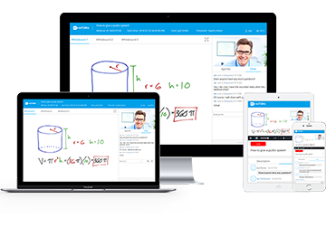
ezTalks Webinar Registration Page
a) A successful webinar registration landing page can lead to higher registration conversion rate. ezTalks Webinar registration page can be customized into the style you like. There are many reasons why it can be regarded as the best webinar registration page.
b) It won’t take up much time, as ezTalks is able to render free and efficient webinar registration page templates. You just need to set relevant information pertaining to the audience that you want in a few clicks. The layout design, font size, blank space and colors of its registration form are well-prepared by ezTalks Webinar platform, which caters to the audience’ visual effect and reduces exit rate.
c) In addition to the webinar registration form customization, you can also change custom logo and design a short but attractive agenda shown on the page for better audience impact and brand consistency.
d) Webinar registration page can be opened via any device from anywhere and at any time. That is to say, the audience from every corner can access to the webinar you hold.
e) After registering for the webinar, those you invited will receive a webinar registration confirmation email allowing to join the event quickly. The email confirmation template provided by ezTalks Webinar doesn’t contain odds and ends, but to make it clear with important points and a link. This aims to boost the “Call to Action”.
You can customize the webinar registration page if you want. But if you want to save time, you can take advantage of ezTalks Webinar templates. All features out there can definitely help you add a special flavor to a virtual event promotion campaign.

Features of Webinar Registration Page Best Practices
User-friendly
A user-friendly registration page makes all the difference in whether an event has a high registration rate. All you set should be user-oriented. A disordered and extravagantly colorful design may force visitors to leave the page immediately. Besides, the registration pages should be accessible via any device so that the maximum exposure of your event can be realized.
Eye-catching
A great webinar registration page will inform visitors what the webinar is about, share the time and date when the webinar is taking place and convince the visitors to register and attend the webinar. All aspects should not be described expatiatory way, as this will impair their interest. The ideal way to do it is to write them point by point and make full use of the webinar agenda template like that of ezTalks Webinar. Most importantly, a successful webinar subject maximizes the registration rates. You need to make sure that your visitor feels valued in just a second when they land on your registration pages.
Clearly Indicative
All the steps you do are served to attract visitors to register for the webinar. Therefore, the call to action button should stand out on the page and make it clear what the next step is. You should focus on getting registrations to your webinar, instead of trying to sell anything here.
Secure
Users will only share their information if they feel safe and secure about the platform. How to establish trust with them first? You can’t use crooked methods to conceal extra cost on the call to action button. It not only violates transparency ethics of webinar hosting, but also kills repeat users for your platform. Furthermore, too many advertisements over there may make the page lose credibility more or less. Only when they feel confident about the webinar platform, they will be willing to fill in the blanks needed.
Easy to Confirm
The email title used to confirm registration should be concise and compelling enough. Only in this way, will they want to go further and finish the confirmation step. A confirmation email can be regarded as an event reminder, as it can remind people of what they have registered for. A clear purpose statement more likely develops higher confirmation rates. Last but not least, no spammy words should be ensured, since there is a group of words that can make your event registration email land in a spam post. This must affect the outcome.
The Final Verdict
A good webinar registration page is the initial step for promoting a webinar online. It seems that the webinar registration page contains few elements, but how to achieve webinar registration page best practices is still worth exploring. It is suitable to pay attention to the aspects mentioned above and take ezTalks Webinar as an example.